Thursday, 13 December 2012
Tuesday, 11 December 2012
POLL TO DECIPHER FILM POSTER FOR 'LUCKY PUNCH'
 Under taking a poll amongst class members, friends and family, each individual had an opportunity to look at each of the posters and then choose which one they believed was most appealing, eye-catching and representational of a boxing film. Choosing to ask a wide variety of individuals i ensured that the results weren't biased. After asking a variety of 35 individuals, i gathered the results. With a significantly larger vote for poster A, i decided to take on board the advise of my peers and use it for my film poster for my coursework brief.
 Friday, 23 November 2012
Tuesday, 20 November 2012
REVIEW OF FIRST DAY OF FILMING
On Wednesday 15th November, I began filming for 'Lucky Punch'. I planned to shoot the two most difficult scenes first, so there was extra time incase any problems occurred.
The first scene i shot was in the car park with both Jake the main character and Angus who played an antagonist that Jake has a fight with on the stairwell of a indoor car park. Having to shoot small clips of each of the boys preceding to the fight, i decided to film the shots handheld to emphasize the idea of the street/rough atmosphere of the scene. As anticipated, i had to retake the shots a couple of times as using the camera handheld sometimes made the shot a bit too blurry and out of focus to be considered as effective and realistic cinematography. When filming the two boys meeting on the stairwell and fighting, i had to ensure this also appeared realistic. I asked both boys to scream at each other and actually act as if they were trying to hurt each other, in order to catch the realism of the situation.
The second scene i shot was in a gym in a basement. With the square room having 3 mirrored walls, it was at first extremely difficult to get the variety of shots that i intended to capture as the reflection of the camera could be seen in many of the high angle and medium shots. Planning to edit the footage into a montage showing Jake training over a period of time, i ensured he changed his costume two times to depict change in time/day. With my focus on gaining a variety of different shots, I even included shots through the mirror, tricking the eye that then panned from the reflection onto him punching the punching bag. I also included close ups in order to try and depict the pain he was going through shown through Jakes' facial expressions. Splashing water over his face, Jake looked like he was sweating more than he actually was, representing that the boxing was tiring and a strain for him. Along with the fake sweat i made sure Jake panted in an exaggerated manner, almost making the audience feel sympathy towards the character and understanding his struggle, the ideas i intend the audience to portray.
Thursday, 15 November 2012
Friday, 9 November 2012
FILM POSTER FOR LUCKY PUNCH
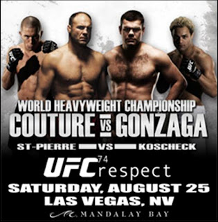
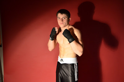
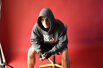
For the film poster for the Lucky Punch i decided to follow a similar structure to that of UFC (Ultimate Fighting Championship). Analyzing different UFC posters i noticed a few common concepts that all the posters had in common. In each poster , the subjects had their hands up as if they were ready to fight. In lots of the posters, the fighter had been photographed in such a way that shadows formed on their bodies/faces. I decided to do the same, creating a shadow effect on Jakes face. In doing so i believe it adds an element of mystery to his character and foreshadows "shady" events that might take place. Deciding the use red and the themed color, i feel this looks extremely effective. Red commonly being a representation of blood, it makes Jake stand out even more by using blood colored silhouettes. This also foreshadows the blood shed that could occur in the trailer, enticing people to watch both the trailer and create a hype for the film.
Tuesday, 6 November 2012
Friday, 2 November 2012
First Edit of Website
FIRST EDIT OF WEBISTE FOR LUCKY PUNCH
The first step i took was to create 5 pages to my website that i thought would be appropriate. Looking at websites for real films with the same genre, i took inspiration in labelling the different pages.
My homepage , i decided to include the title of the film in bold and in big text so it is immediately noticeable, although it is effective i believe it could the text could be more interesting and that i should also add details of the release date below for viewers. These are changes i plan to make on my second draft. The middle of the page is where viewers will be able to view the trailer, not having filmed the trailer yet i cannot insert the clip, the one there at the moment is temporary.
My second page is the "Cast&Crew" page, so far i have inserted pictures of the 3 actors in my film but havent included text or background information on any. I also need to include pictures and information on the crew.
My third page is "About the Film", giving background information to the film such as plot and characters. I plan to fill this in once i have filmed the trailer but so far i entered a picture of Jake who plays the character of Tom in one of his MMA fights. I believe this makes it a realistic representation of a boxing film website.
Website Design
WEBSITE DESIGN LAYOUT : FIRST STAGES
As part of the brief, i must create a website for the film to promote it. Using Wix.com a free website designer, i plan to create a website that has a boxing theme to it that will market and advertise my film as effectively as it can.
My first step was to choose a layout for my website, wix.com has an advisory pannel that categorizes different layouts into groups of what it helps represent the most. With the purpose for my website being to promote i film, i choose the film category.

Looking through the different designs, i decided to choose the "Event Production" layout and theme for my website and it was modern and had the most video friendly facilities on the web pages.
Once choosing the "Event Production" layout, i then was able to begin editing the website, adding text and images, video and shapes.
Subscribe to:
Comments (Atom)


